Food For Thought:This was really interesting to see which alumni and from which years attended art schools. I think ultimately lots of kids go to college for the same reason: to do something they are passionate about. Prior to this year, I honestly had no concept of what an "art school" is, and it sounds like a lot of fun, however, I have so many interests, I know it is not for me. I want to be able to bridge my artistic knowledge and creativity and carry it into my work as an urban planner, designing and redesigning urban structures to be more sustainable for the future. Bailey spoke out to me a lot in how he was interested in politics but then per chance stumbled upon architecture. I think architecture and urban planning are especially interesting fields that bridge many different disciplines. I think ultimately, in whatever career I so choose I want to be able to be passionate about it and I want to create, maybe not to the extent of the artists, but definitely I want to be able to produce, innovate, problem-solve, and create solutions. Another thing I was interested in hearing about was the different way the programs were set up. One guy thought that VCU did not challenge students enough going in, while another girl enjoyed the rigorous pace as to which she started off in drawing. Each student enjoyed different aspects of the art field. Coming out of this, after having applied to college, I'm realizing how kids that are happiest at their colleges are kids that choose to follow and learn something that they can be passionate about. Going forward on my college adventure, that's the most I could hope for.
0 Comments
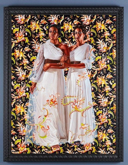
I am incredibly bummed to have missed this actual lecture. To make up I did some additional research and watched the videos posted on Mrs. Mosley's website. I think Freyer's art is very interesting. He calls into question conceptual art, which for me I struggle with as an artist. My art frequently stems from spontaneity and is largely subject-based. For Freyer, his art is in the experience, in the concept of ideas such as conversation. Freyer interestingly pointed out how, for many, conceptual art is hard "to get." To understand conceptual art, there is a more frequent need to have a larger knowledge of the art world and the artists that create. I very much agree with this statement. Many of my friends simply don't appreciate conceptual art, because they don't get it. To be honest, however, I do understand it. Conceptual art in itself is technical and can be harder to appreciate. I admire those who explore concepts through art. Freyer's exploration of conversation is personally a really engaging and fun way to approach being present in life. Freyer in multiple pieces notes on the importance of conversation and his work often incorporates conversation. His piece, "Fifty Conversations From The Other Side," involves having a conversation over coffee. In another work, Freyer has two people sit for twenty minutes. At the end of twenty minutes they then share a glass of water. After finishing their glass they drop in a dollar coin, fill it back up with water, and then Freyer seals the jar, and that is the art. I think this is a really interesting concept that promotes much needed conversation on the importance of being present - not being on your phone, engaging and really listening to someone. I honestly would really love to do the water piece. I would be interested to see what I talked about with someone else. Overall I really enjoy this artist. Hopefully I will be able to meet him in the future. Want to learn more?Watch Freyer's Ted Talk to find out more. This gallery was absolutely amazing. There were multiple pieces that I felt resonated with me. There was of course the more traditional rendering of figures in the Kehinde Wiley pieces. Below in the bottom right I have featured, "The Two Sisters." I absolutely love this piece - much like I absolutely love every single other piece done by Kehinde Wiley. I just admire the incredible realism in the figures that Wiley is able to achieve. Furthermore the dresses of these women are absolutely fabulous. I took some close ups of just the fabrics. If I time in the future I think doing a few studies of the fabric could really help my future drawings of dresses. Additionally, while slightly a different media, I absolutely fell in love with the photography of Sally Mann. Her pieces center around her daughter, who is often unclothed, however the posture and positions in which she is placed renders a highly powerful composition and greatly reminds me of female power. I love her compositions. At the actual gallery, there were only two pieces featured, however, on the website, there are some additional ones that I highly encourage you all to look at. My final favorite piece was, "Toothless," done by Sonya Clark. Clarks pieces are highly content-based. Clark is a Richmond based artist. "Toothless" revolves around the idea of aging and how gradually we become toothless as we age. It also revolves around the idea of the struggles of African Americans. Her installations are extremely interesting and I am very inspired by her conceptual pieces. I like her exploration of the idea of time. Perhaps in my "frivolity" themed work I could incorporate more of the idea of time to make for more powerful conceptual work. I'm not sure though but is it possible however to have a powerful piece if there is not powerful content? Check out these cool links for more info:
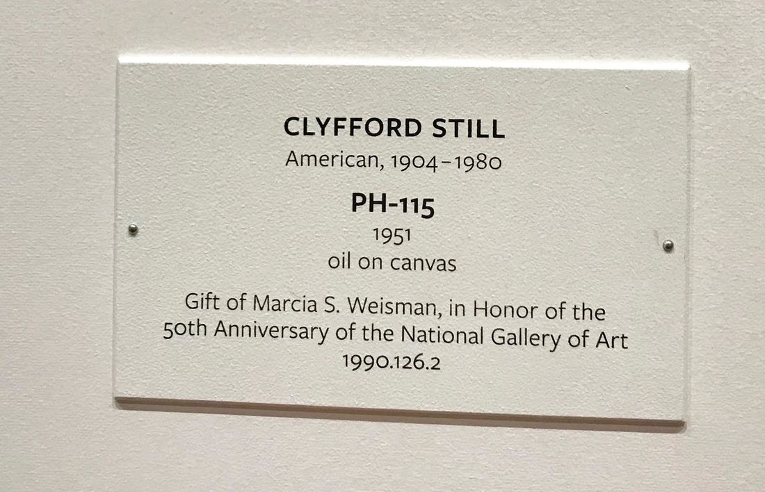
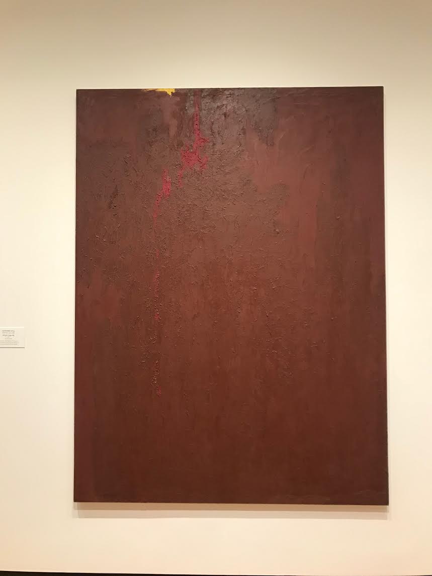
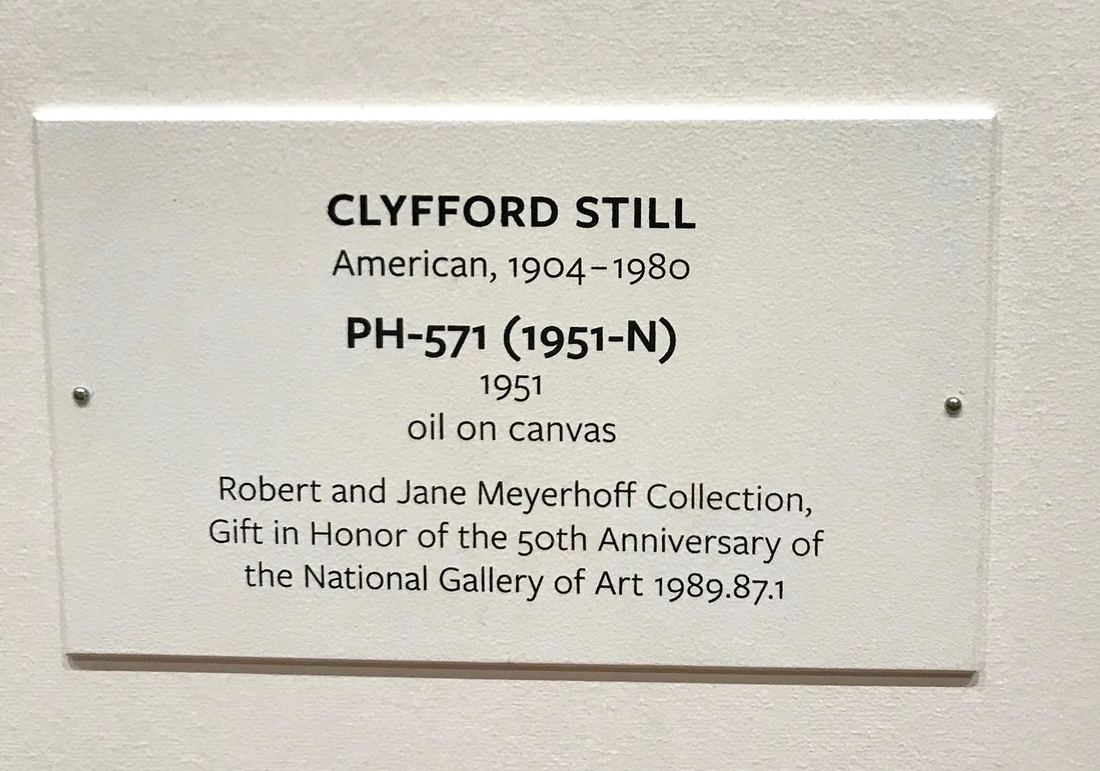
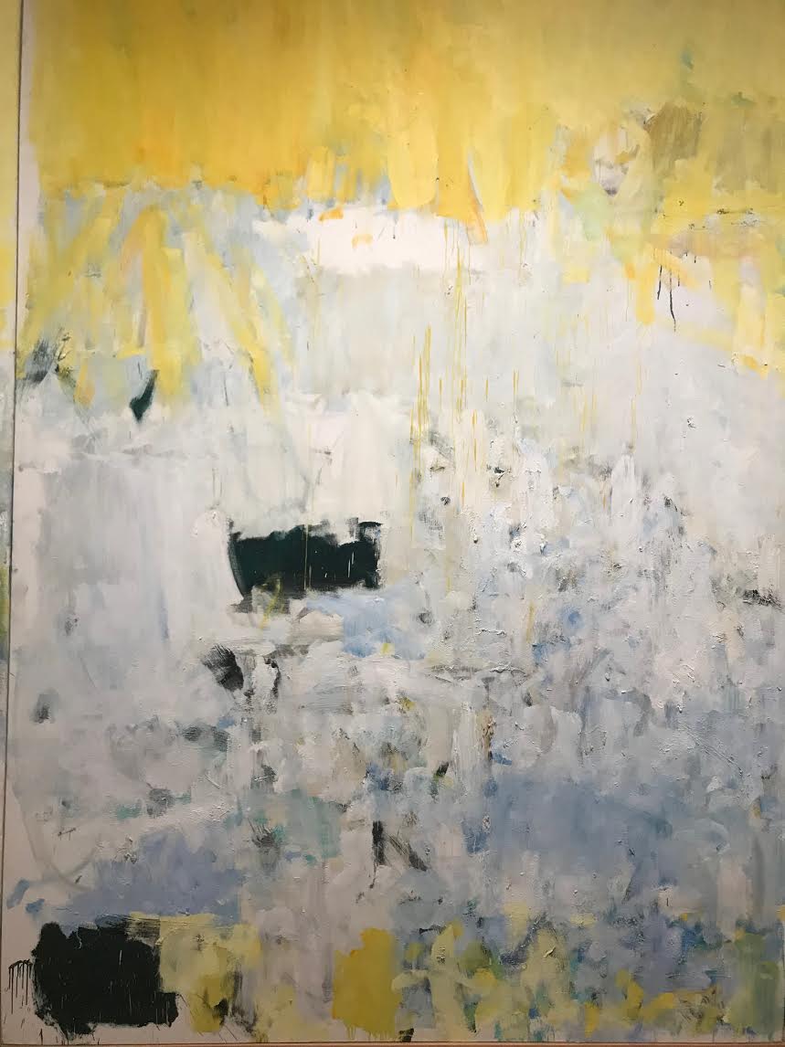
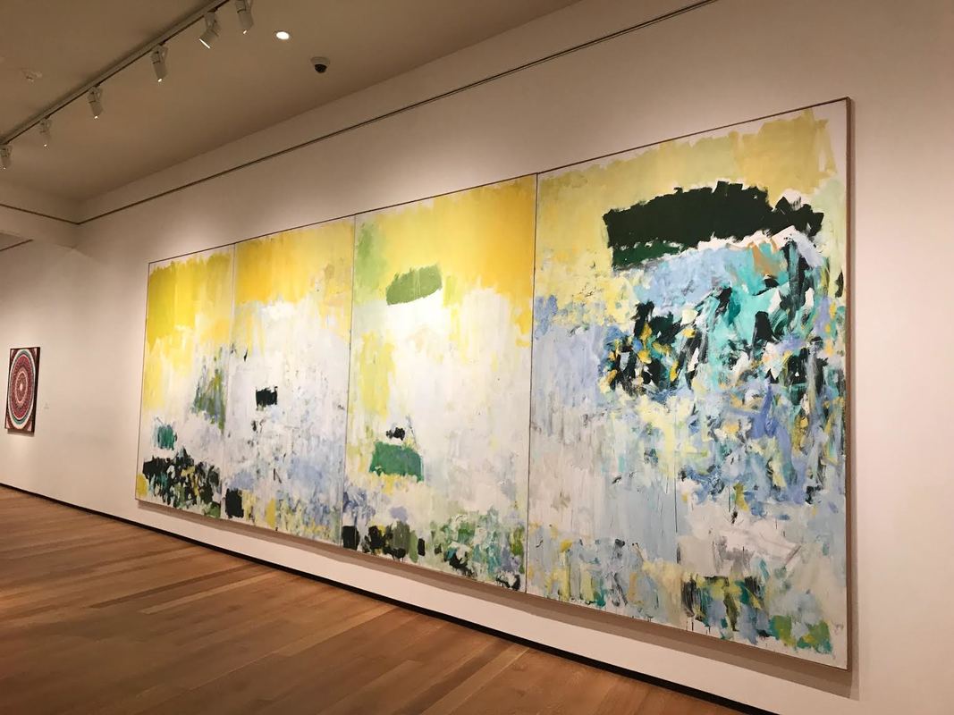
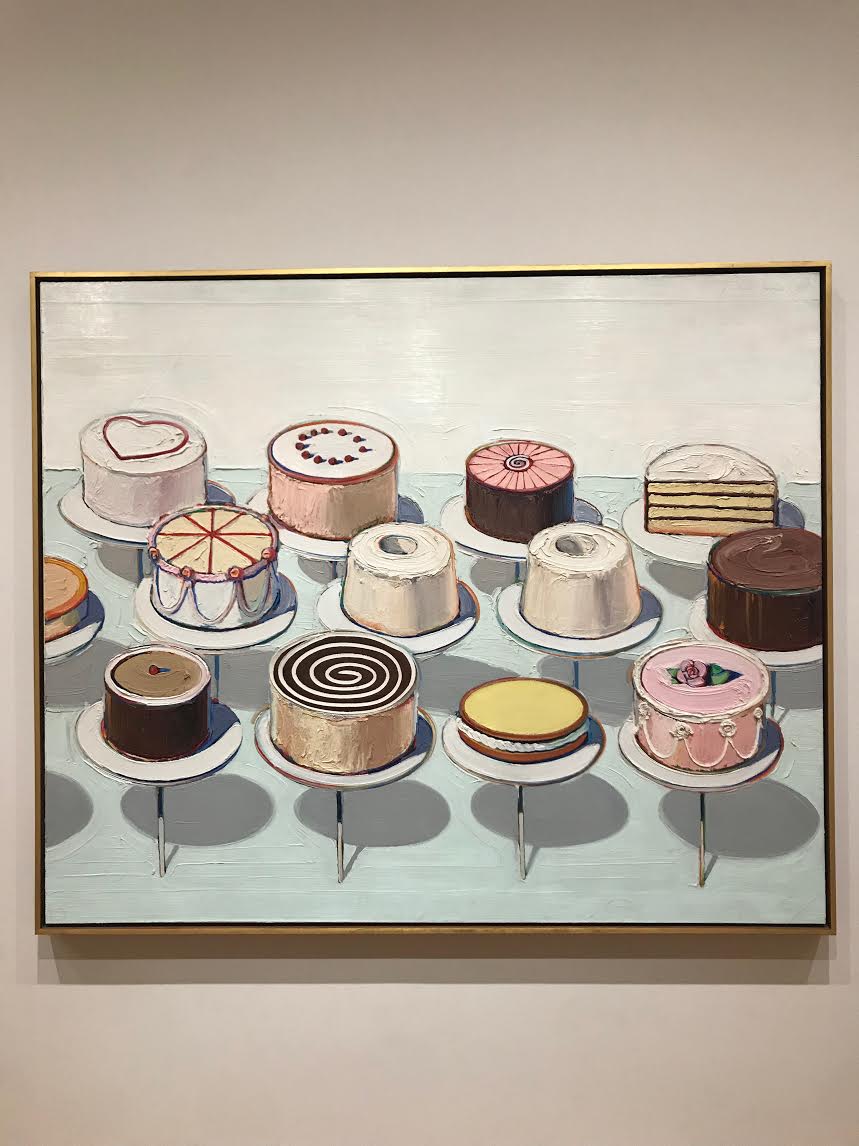
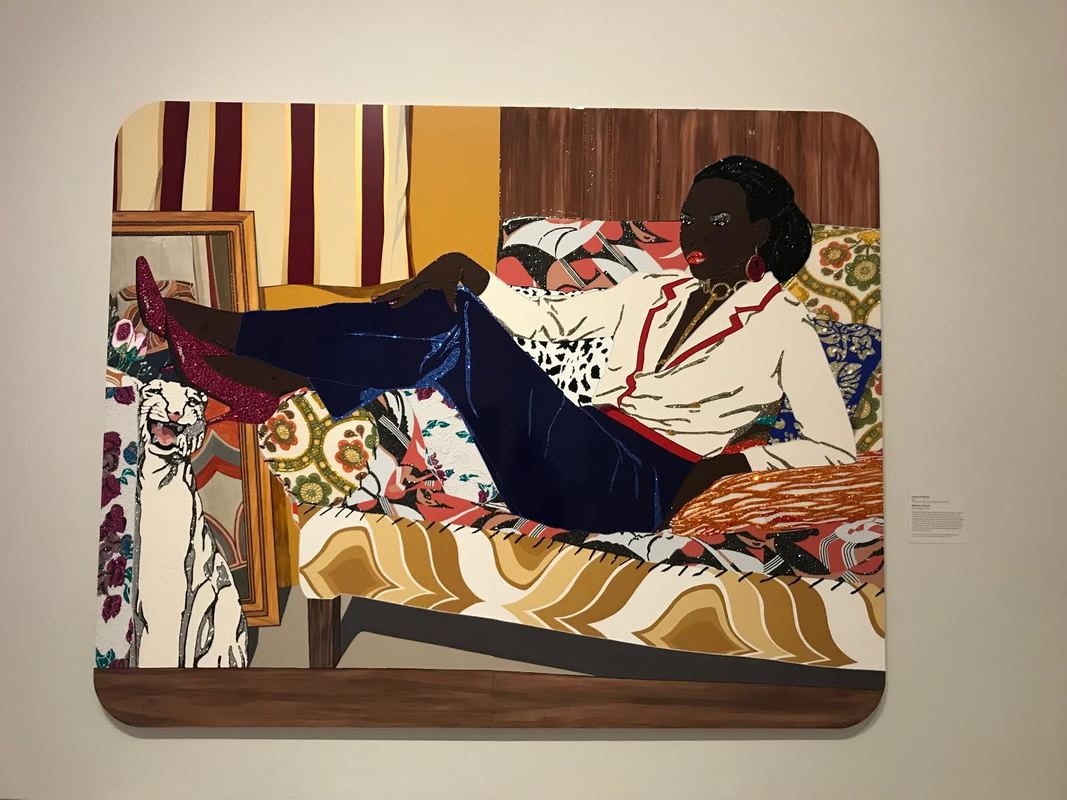
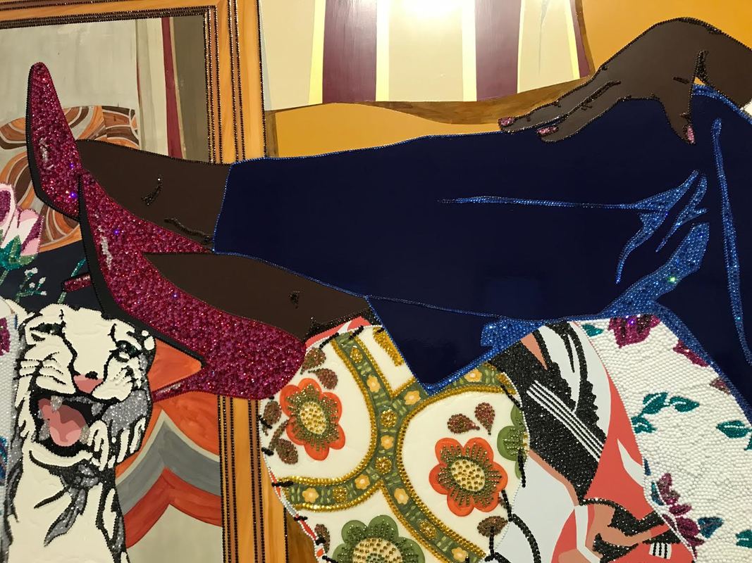
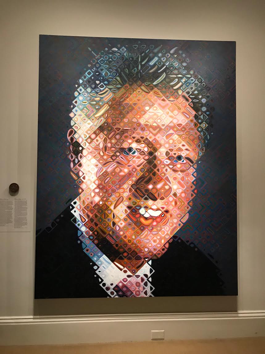
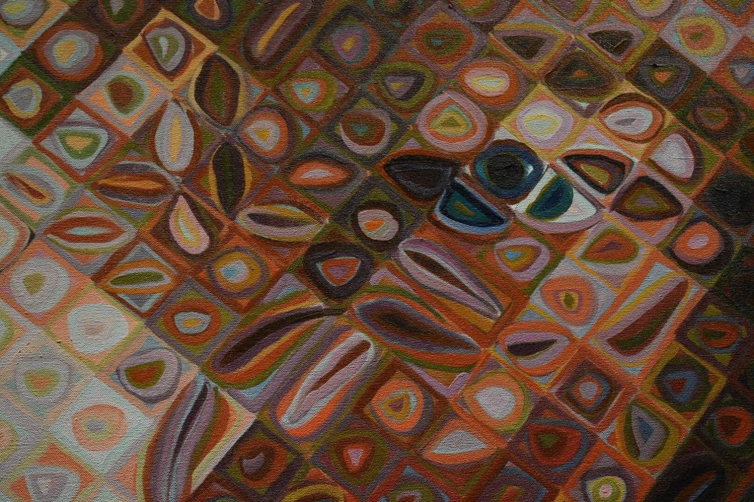
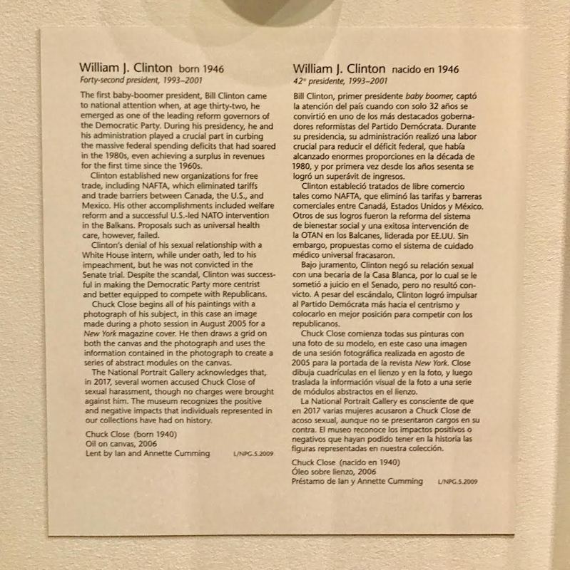
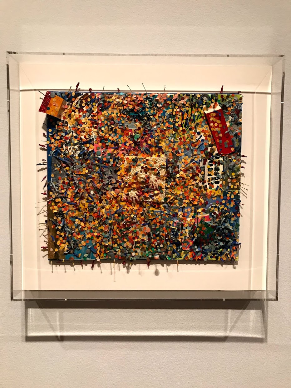
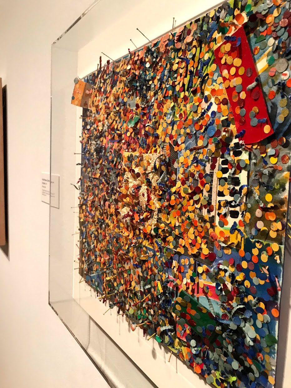
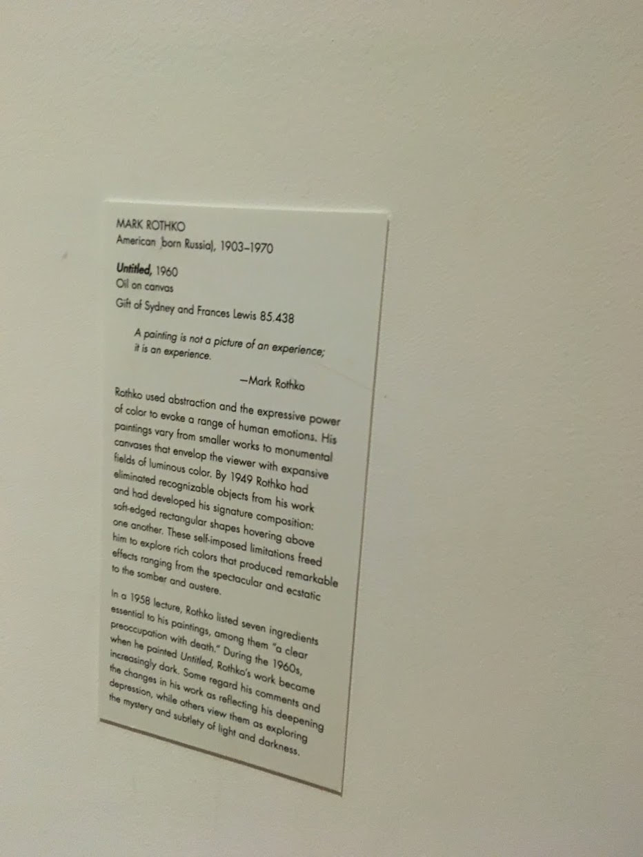
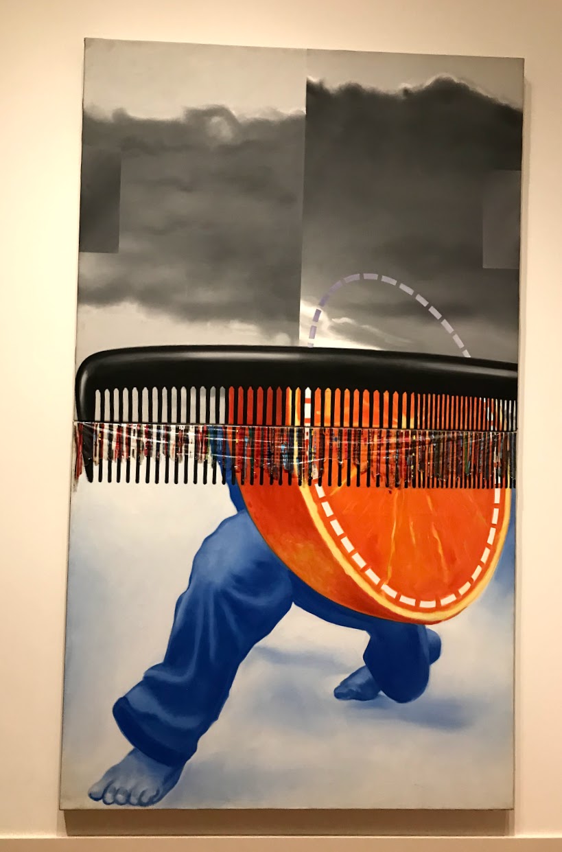
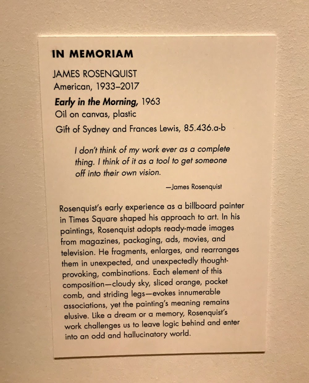
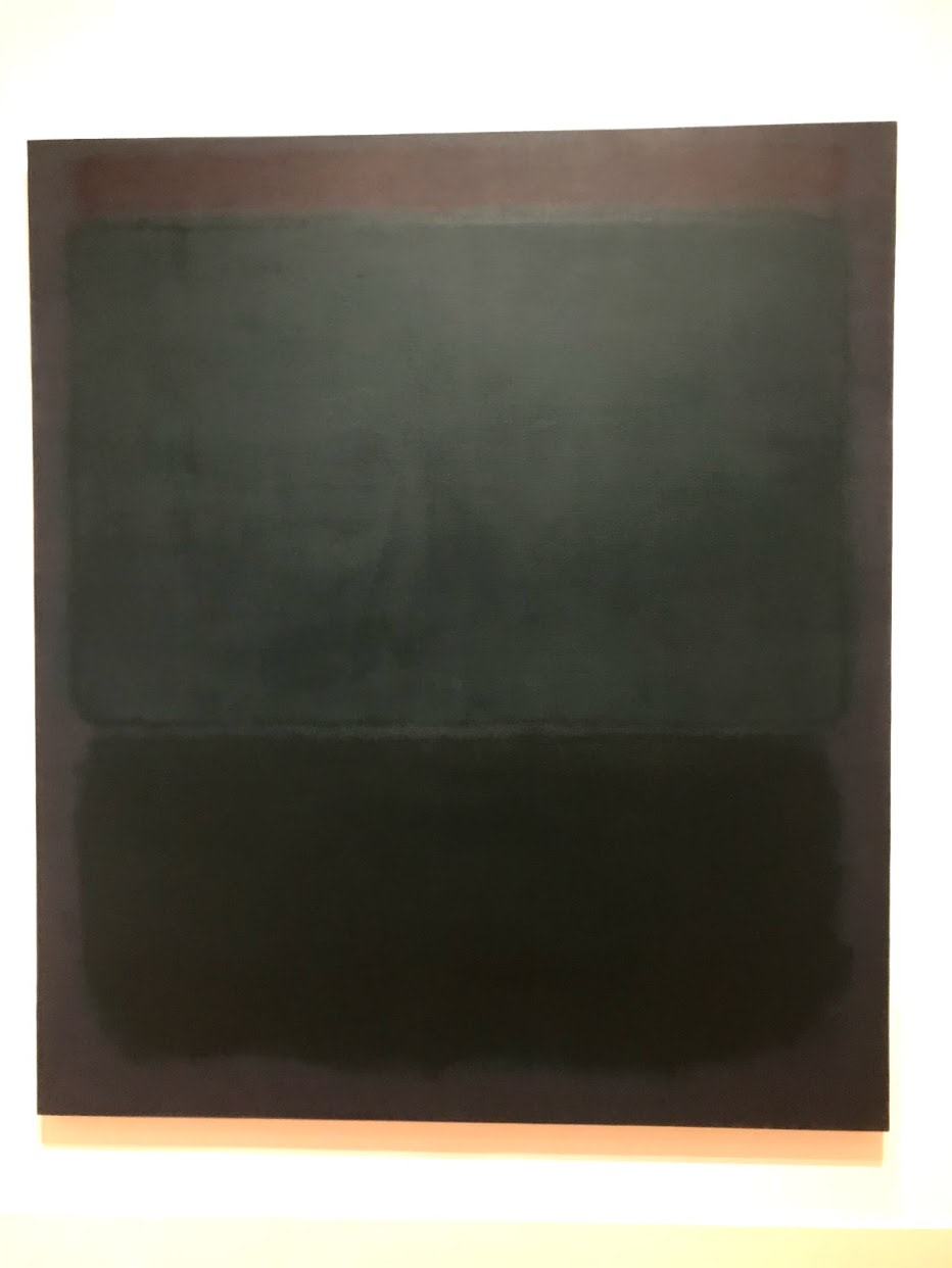
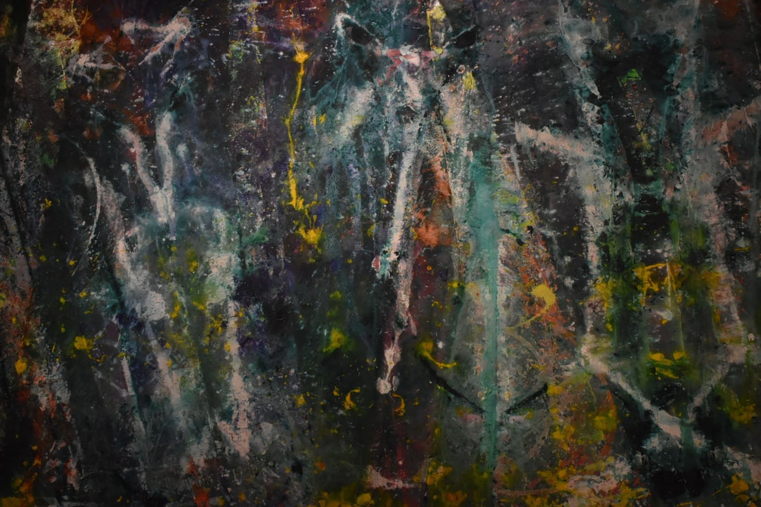
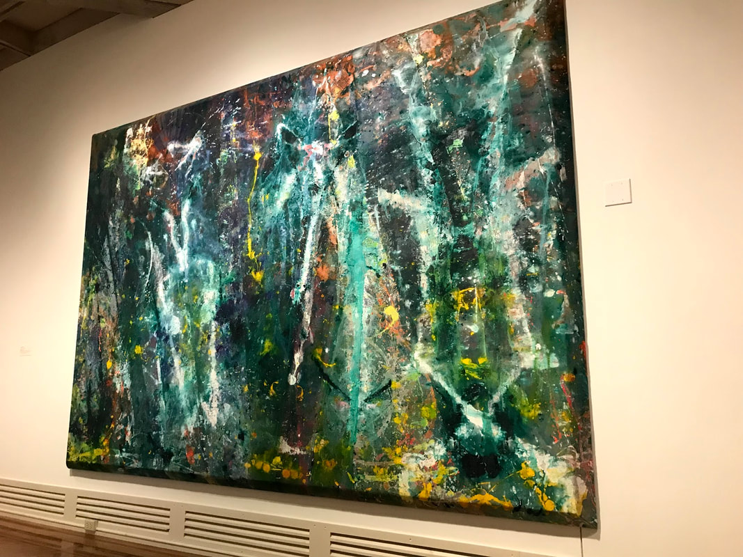
Sally Man Website: www.sallymann.com/early-work Sally Man Work at Try-me Gallery: www.try-me.org/gallery/mann.php The Try-Me Gallery Collection: www.try-me.org/new.gallery.php Sonya Clark's amazing concepts: sonyaclark.com/concept/combs/  I was watching the short on Garry Winogrand and I absolutely love - not only everything about the subject but also the cinematography of the video as well. I think this talk is really interesting in how Waters has developed and established herself both as a successful career artist and as as an artist in academia. I think that a lot of times art frequently gets the rep of not being financially stable, and there is the stereotype of that, “starving artist,” however it’s really interesting to see how our Lunchtime Lecture Guests come in, passionate about their art, and always talk about how they make a living. I find it quite interesting - as there are various ways. But yes, in most cases, all the artists have a “day job.” Which makes sense. I think that in finding what you love to do, it is necessary to find a career that interests you, that supports you, and that you can grow and develop as a person. I think this is somewhat similar to what I ultimately want to do in my professional career. As of now, my main hobby is dancing - I dance close to fourteen or more hours a week, and when I am older I would love to be a semi-professional dancer. However, arguably dancers get paid less than other artists. In addition to my dance I want to study urban planning and hopefully work part time in that field. In this way I can work part time in an interesting, financially stable job, and also enjoy dancing part time. I believe that for those who revel in the mastery of the arts, it’s important to bring that with you as you age - continue your studies and passion for art. To learn more about Ms. Freyer here is a great link that gives a good summary of her work and accomplishments: arts.vcu.edu/photofilm/people/sasha/ Want to learn more about Cinematography? Check out this video: Last Friday, our art class went to DC to explore the national art galleries. Specifically, we looked for pieces that we could build off of or that related to our past works. For me, I looked for figures. Ultimately, we did not see many figure-related exhibits, however, we went to the National Portrait Gallery, and found some amazing pieces. Additionally we looked at Abstract Expressionist paintings in light of our upcoming Abstract Expressionist Project. Abstract Expressionist Pieces:1.2.3. The first piece almost reminds me of the side of a riverbank, where different colors emerge due to the range of different plants, animals, and often runoff that mixes in with a stream. I really love the title and how it really challenges the viewer to really feel the almost chemical sentiment of this piece. I think here for the most part, the artist utilized large, gestural brushstrokes, using several different layers, tones, and colors to add depth. This piece largely reflects the large, compositional, tonal abstract expressionist style - much like Rothko’s characteristic style. For me, personally, I find Rothko’s paintings largely uninteresting, however, this piece makes a statement. Rather than making the piece fully one tone, the artist utilizes the right side, adding stripes of color, as well as borders small pieces of the edge, giving a largely different feeling than Rothko’s pieces. The second piece is captivating in its depth. From afar, there is little to be seen, however, as the viewer approaches the piece, they can take note of the slightly different hues, and the different thicknesses and textures of the paint. The application and layering of different colored and textures paints a really captivating dynamic between the two elements in that, while the color change is very subtle, there is dramatic effect and statement in the differing texture. The third piece is my absolute favorite. I really enjoy the idea of painting “big”. There is an interplay between the canvases, however, they do not exactly match up. Here the artist seemingly used a large brush and made shorter strokes. There is a sense of spontaneity and looseness in the application of the strokes, however, that remains enjoyable, and gives a sense of energy to the piece. Each of these pieces, compositionally and stylistically differ; in color palettes, and expressions. The first and second are largely more meditative and contemplative, while the third is quite joyful. I was largely surprised by the different applications of paint and the general use of texture as an element in these pieces. I think from my studies and seeing of abstract expressionist pieces online it is especially hard to see differing texture in a piece, however, I really enjoyed looking at the different layers up close. I think in general, for my future Abstract Expressionist painting, I want to do many different colors and experiment with dynamic application and a more colorful color palette. I am curious, however, as to whether or not there is a restriction to how one can apply paint in Abstract Expressionist art; can an artist only use a paintbrush? Play Pages:1. I really enjoy the frugality and frivolity of this piece. Its static in its composition, however, its subject, and artistic rendering make it a truly fun piece. I mean, who doesn’t love cake? I think ultimately pastel-like color palette as well as the paint medium ties into the almost indulgent content of the work. At times there is just so much that one cannot consume all. The intangibility of the 2D work plays with the viewer. After seeing a sweet, often people really want one. The irony behind the work plays off of want and not having. I think that my play pages are very fru-fru and I really like the idea of adding more to them. Compositionally, I want my figures to be doing more than just standing, and I really like the idea of adding more “indulgent” elements to my overall work. 2. I absolutely ADORE this piece. I have really enjoyed playing with the female figure, and the use of glitter and gems. Of course, the immense size of this piece screams authority, however, the use of gems draws in the viewer from across the room. Ultimately, Thomas makes a statement on the beauty and power that an African-American woman wields. There is a stark dynamic between sparkle and matte which I think adds an effective contrast between what is “important” and “unimportant.” The woman’s clothing, jewelry, and shoes are bathed in gems, serving to highlight the figure and bring her to the forefront of the work. The frontal composition, additionally highlights the figure and establishes her as the focal point of the piece. In the past I have played with sparkles on my figures’ clothing, however, I also really like the idea of playing with them in the background. I think after this trip as a whole, I really would like to playing with more dynamic, and interesting backgrounds to my pieces. 3. This piece, aside from it being a portrait, really has nothing to do with any of my past play pages, however, I just admire the true ingenuity of Chuck Close. From afar, the figure looks almost realistic, however, upon closer inspection, the figure consists of almost incomprehensible blobs. Close’s use of color really highlight the figure’s features and bring to light the dynamic nature of a face in three dimensions. The static, closed composition, establishes and highlight Bill Clinton as the subject. The technique is truly truly MIND BOGGLING. I really cannot understand how he does it. I don’t think I would ever be able to replicate this in future art works, however, I really would like to push the abstraction in my rendering of figures using similar color theory ideas.
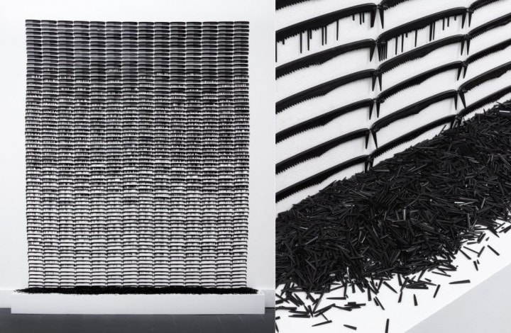
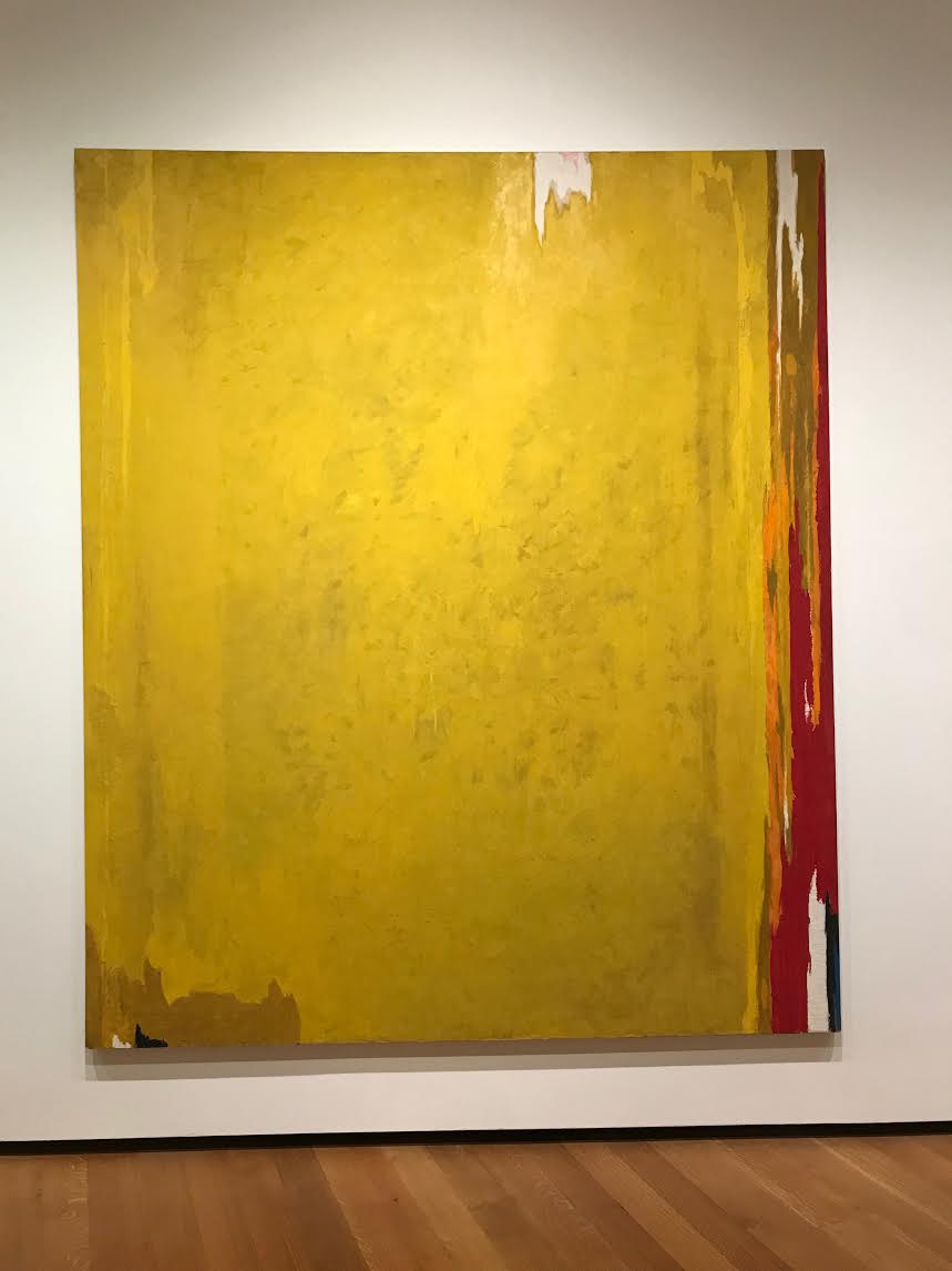
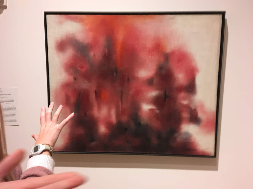
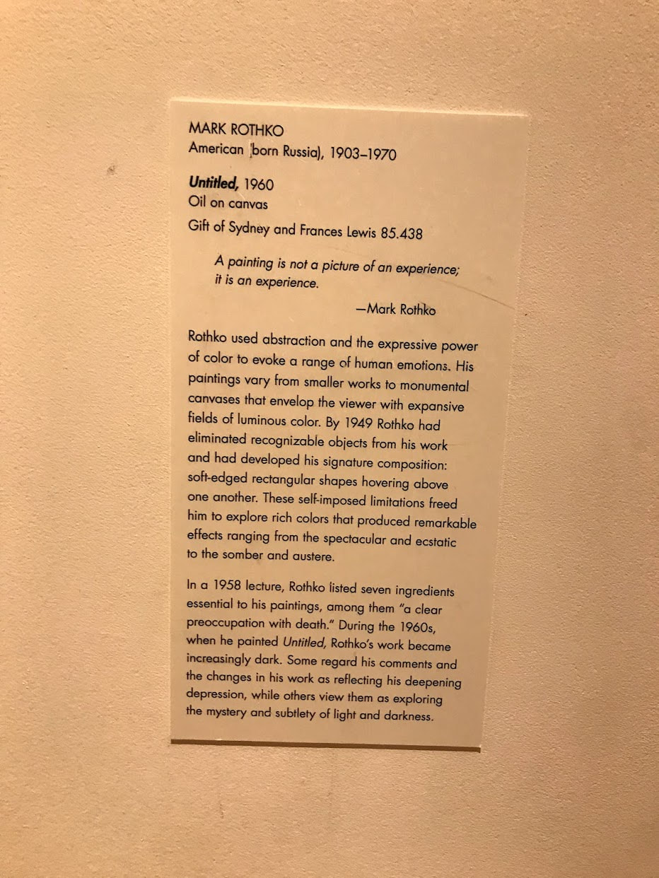
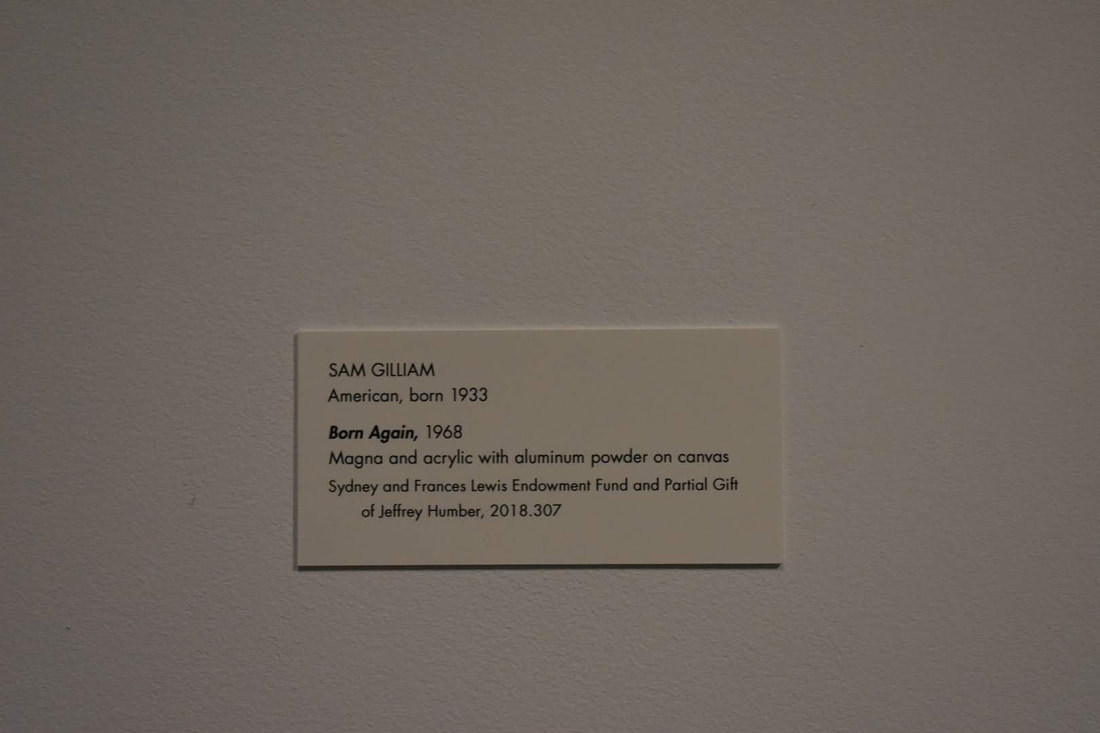
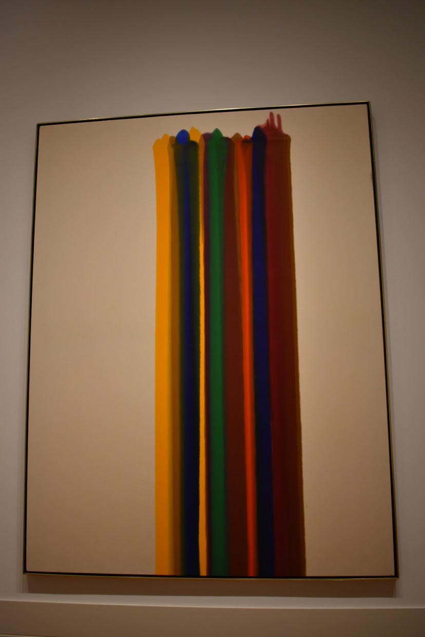
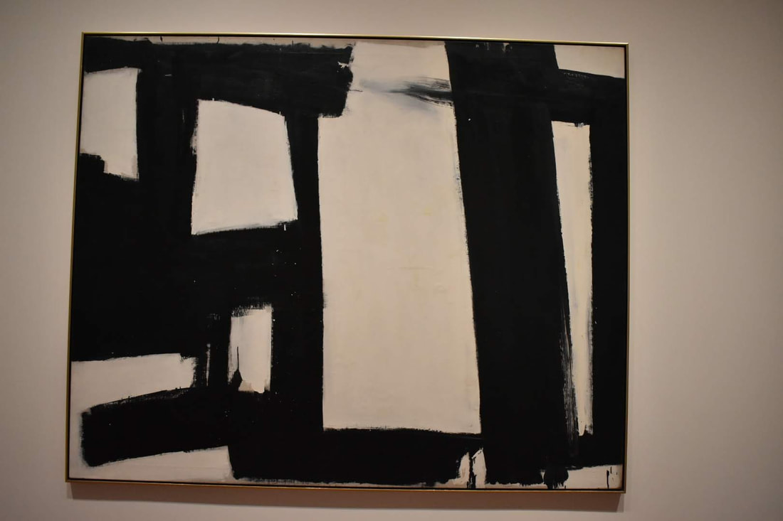
Activity A - Howardena PindellA Reflection on the Howardena Pindell Exhibit: Last Monday, our art class went to the VMFA to explore the makings of Howardena Pindell. Ultimately, Pindell’s art was meant to challenge the art world, push the boundaries by bringing into question what was an acceptable subject, what was an acceptable medium - which can be seen in her layerings. It was extremely interesting to see the evolution of Pindell’s works - initially Pindell’s work solely reflected her connection to numbers and hole punches, however, after her car crash, Pindell’s work seemingly blossomed. While her later work still retained much of her hole-punch and tonal motifs, the depth and meaning of her later works inspired much more thought. Ultimately, Pindell’s work all were interrelated, by sharing similar motifs - such as her hole punches, and numerical content, and then later, her stitching and autobiographical content. I think ultimately, what can be seen here, is that as we grow and change, so does our art. Pindell’s life’s work embodies the Stretch and Explore, Express, and Engage and Persist Artist Habits of Mind, in the way she adapted to change, created and developed personal meaning for her work, and sought to grow and develop her own personal art. For now, my interest in figures and dresses I think has a lot to do with my life - one, I’m always dressing up for dance - which encompasses the human body and figure - as well as the costume and performance. Two, the lightheartedness of my pieces are also representative of my creative process and why I feel the need to create art. Overall, I personally didn't much care for Pindell’s earlier works. The overall composition that consisted of layers of hole punches, along with a wax-like coating to give it a textured looking consistency, more or less made me think of “artistic vomit”. I think it is fun, however, maybe not my cup of tea. Her later works, however, I found to be fascinating. Looking at her larger compositions it was interesting to see how her layers brought out the depth of her content. I found it especially interesting to find and deduce the different symbolic representations in her pieces, such as the wheels representing the car crash in her autobiographical piece. Activity B - Abstract ExpressionismIn light of our upcoming abstract expressionism unit, we also took a look at all of the Abstract Expressionist paintings. Non-Objective or Abstract - Where do you draw the line?1. Non-ObjectiveNon Objective features a work in which there is no discernable subject, but only features shapes - organic or inorganic. 2. AbstractAbstract is a work in which a recognizable or realistic subject is changed or altered in a way in which it is still recognizable, but not featured as the way it exists in the actual world. Abstract Expressionism - What falls into this specific category?Abstract Expressionism is a movement that originated around the 1950’s. The movement emphasizes the spontaneous application and expresses the wholistic and encompassing force of art. The three dominant approaches include a liquid, dynamic application of paint, or bold, textured, brushwork, or large paint fields that achieve almost a meditative feeling. Mark Rothko’s achieves the third approach by utilizing diaphanous layers of analogous colors to embody a meditative and contemplative mood. Mark-makingHere is an example of the first dominant approach in Abstract Expressionism where the artist has utilized a dynamic, gestural, application of paint. Seemingly here, the artist loosely applied paint, both with loose, almost carefree strokes, or splattering. In this piece, Louis encompasses the Abstract Expressionist use of color and bold mark making. It almost seems that the paint was poured vertically and left to fall down the painting. This third piece, also looks use large, gestural, and bold brushstrokes. The rather dynamic composition suggests that the artist used long, shoulder-utilizing brushstrokes to create his marks. Art Elements, Design Principles, and Specific Compositional Choices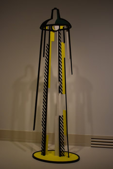 Roy Lichtenstein American, 1923-1997 Lamp II, 1997 Painted Bronze Gift of Sydney and Frances Lewis, 8.5.511 This sculptural representation of a lamppost by Lichtenstein highlights the commonality of the everyday object, and brings into question what is real and what is not real with the interplay of abstraction of a tangible, real, object. While viewers may pass lampposts everyday without a second thought, they ultimately will stop for this one, in order to enjoy this dynamic interplay between reality and invention. 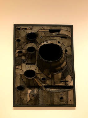 Lee Bontecou American, Born 1931 Untitled (No. 25), 1960 Welded steel, canvas, copper wire Gift of Sydney and Frances Lewis 8.5.364 Bontecou’s use of shape and form challenges the viewer by both giving invitation and repulsion. The use of form to create depth creates “gaping holes” or sorts, or abysses that draw in the viewer to take a look inside, however, at the same time, the dark and almost decrepit tone of the piece, results in the viewer to take a step back. In this way, their exists and interaction between artist, art, and audience. 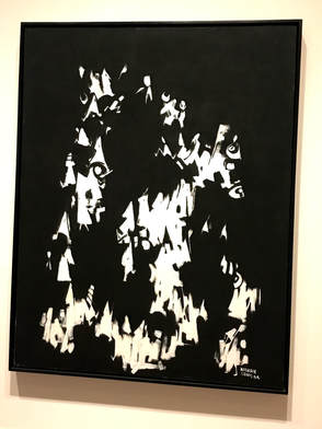 Norman Lewis
American, 1909-1979 Post Mortem, 1964 Oil on Canvas Gift of the Faberge Society of the Virginia Museum of Fine Arts, 2001.9 Here, the stark contrast between black and white, and hieroglyphic-like caricatures, emphasizes the political content of the piece, in which Lewis depict African American struggle for equality throughout history. The continuity of the piece highlights the the protests, marches, and struggles. The black and white contrast ultimately challenge’s the viewer's perception of positive and negative space, what is real, what is tangible, what is at the foreground, and what is the background. 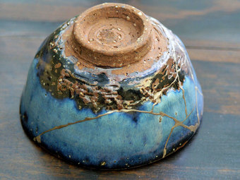 Last Wednesday, Amanda Dalla Villa Adams, a VMFA faculty and independent curator, presented a Japanese Aesthetics lecture during lunch. All in all, I really enjoy and appreciate the concepts behind Japanese Art. For much of its display, there is a play between the contrasting light and dark, which, symbolically stands for many things: death and reflection, simplicity, beauty, etc. I think that the practice of Wabi Sabi and Kintsugi are absolutely genius. Essentially, these practices embrace the beauty of brokenness - imperfection is ultimately more valuable than perfection. I also appreciate the powerful simplicity of Notan and the interplay between dark and light to create a conceptually complex piece of art. I think that there is fault in the practices of the Modern-day World where we strive for perfection, are always on the run, and never have time to truly stop and appreciate beauty - including our own beauty and that of the outside world. There is something important to be said in the Japanese Aesthetic’s simplicity, and there is for sure something that the Modern-day World can learn. There is an ultimate need to slow down, in essence to appreciate beauty, because beauty is fleeting, and so are we. On retrospect, the simplistic and truthful concepts of beauty covered in the Japanese Aesthetic ultimately is reflective of the value of balance. Jun'ichirō Tanizaki wrote in, “In Praise of Shadows,” “Were it not for the shadows, there would be no beauty.” Want to see some examples of Kintsugi? Visit this link: https://www.lifegate.com/people/lifestyle/kintsugi Ever want to try creating your own art using the Japanese Aesthetic? Visit this link: http://emptyeasel.com/2008/08/12/seeing-notan-how-to-make-stronger-compositions-using-lights-and-darks/ Need some more help understanding the Japanese Aesthetic? Watch this video on Wabi Sabi: |
What's Up WorldUpdating you. Archives
February 2020
Categories |
 RSS Feed
