|
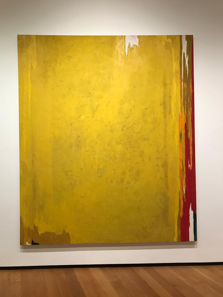
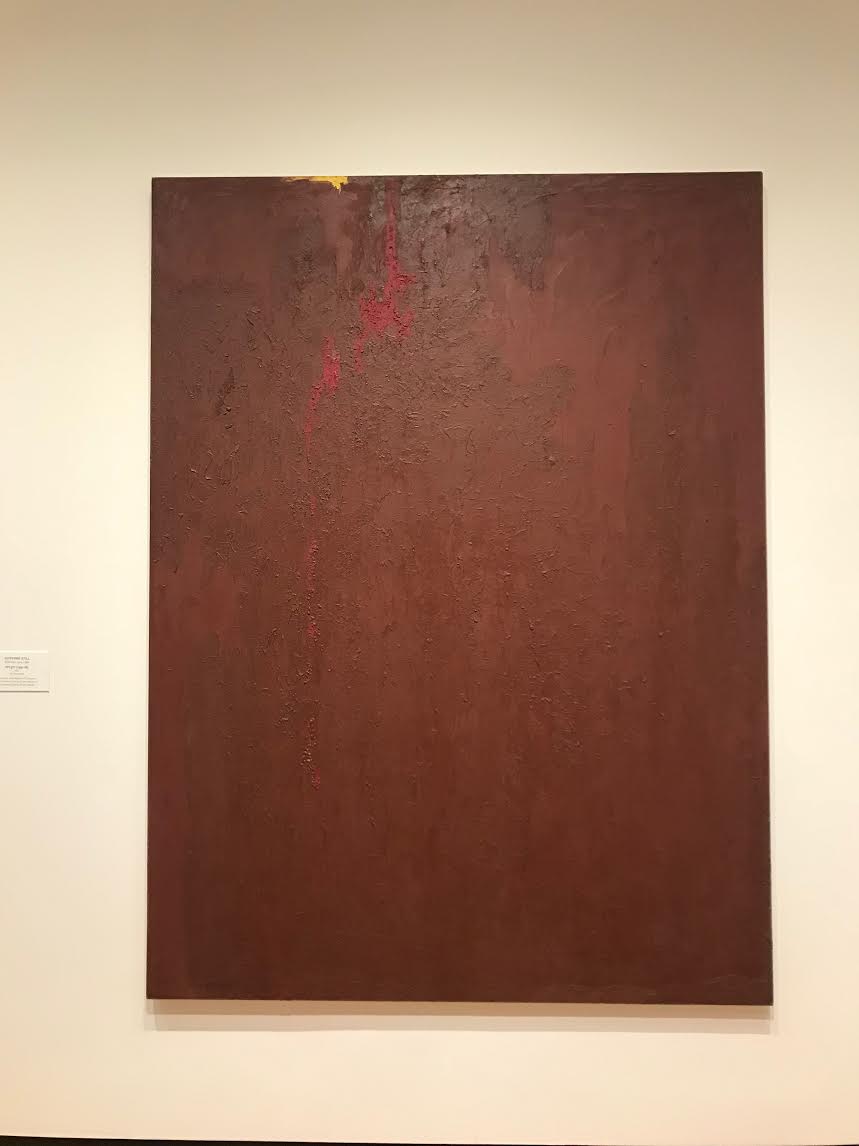
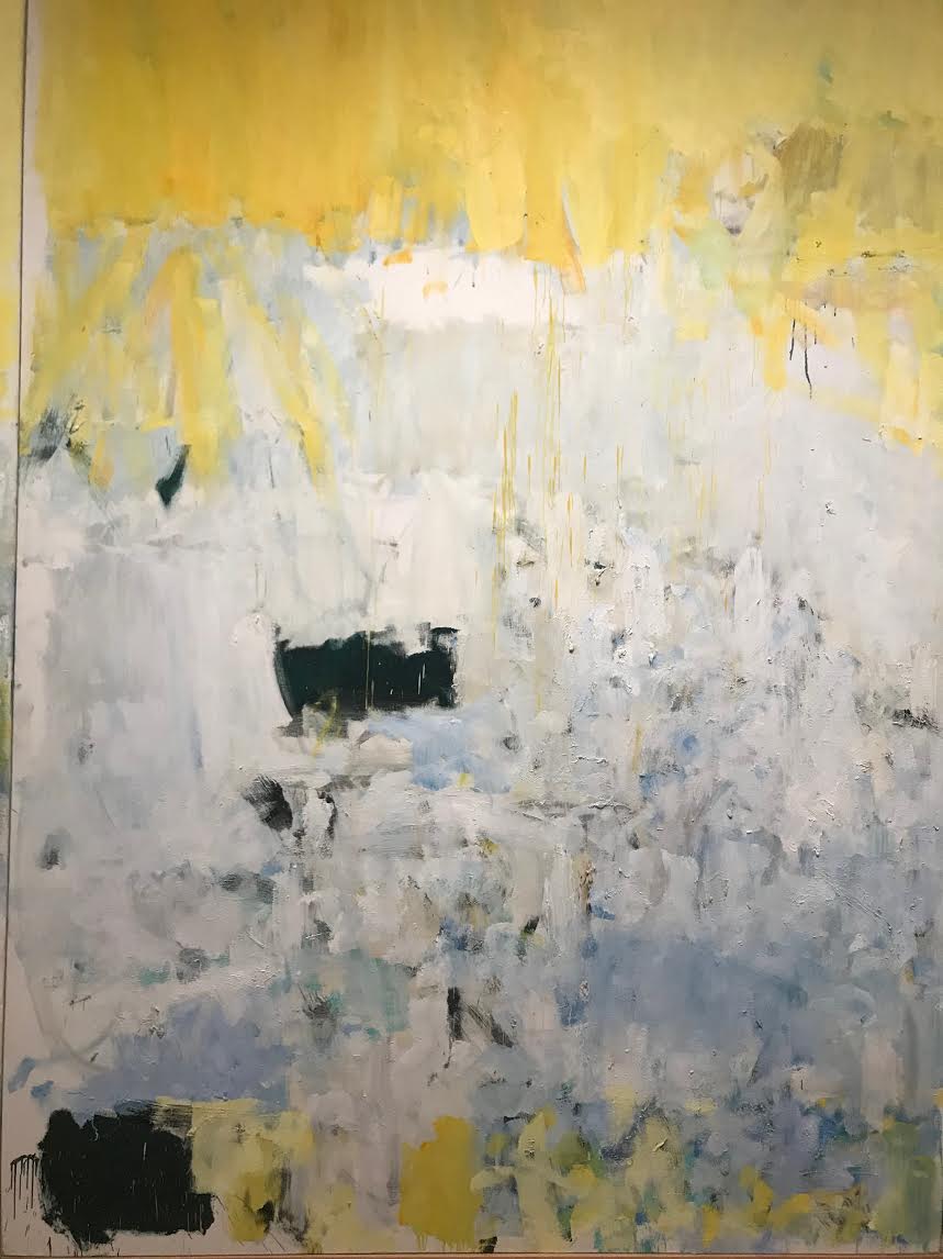
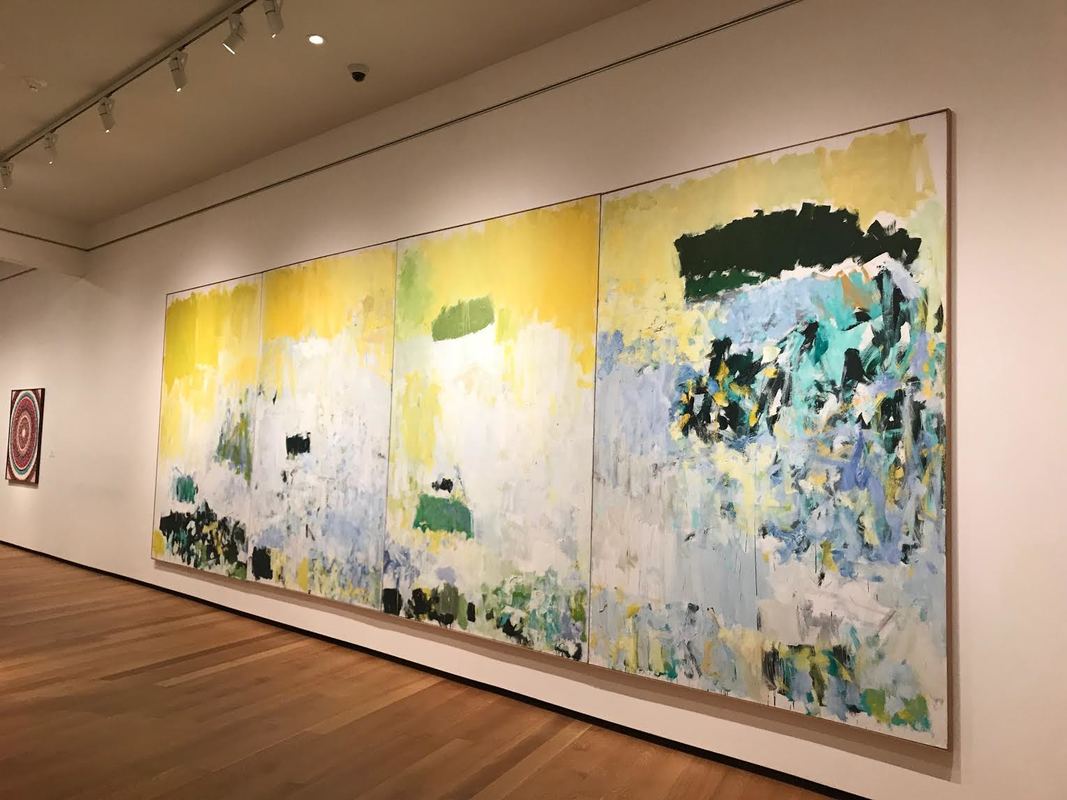
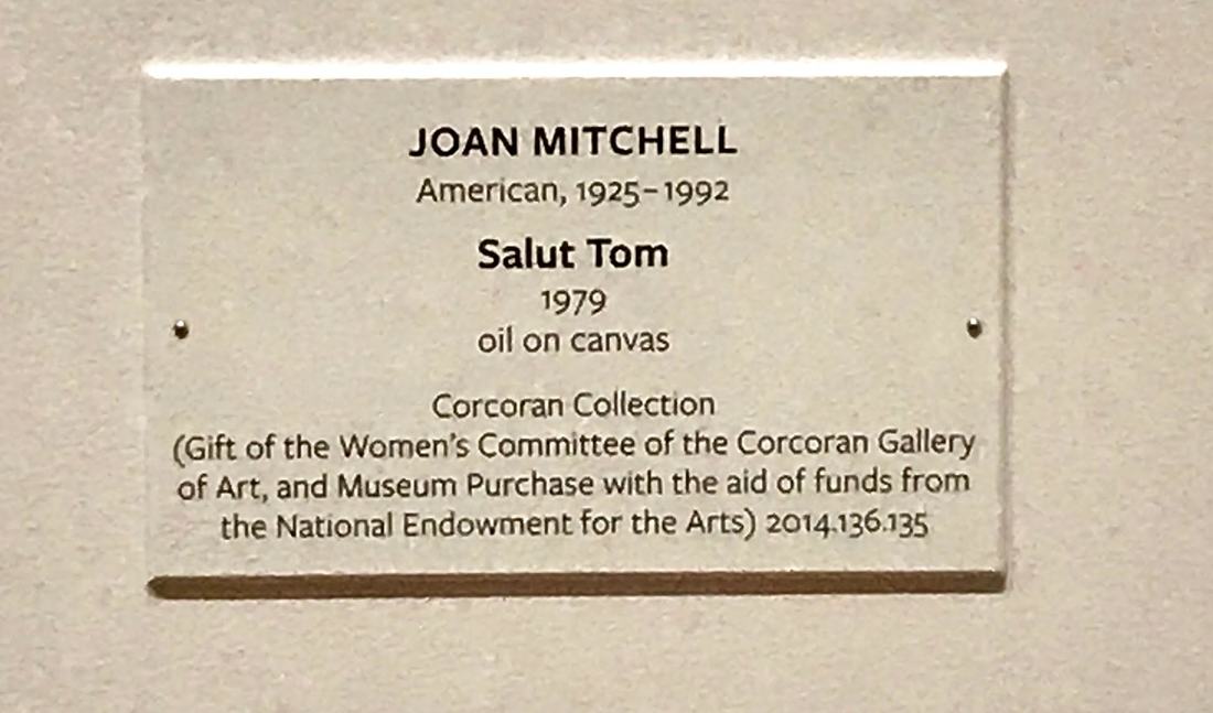
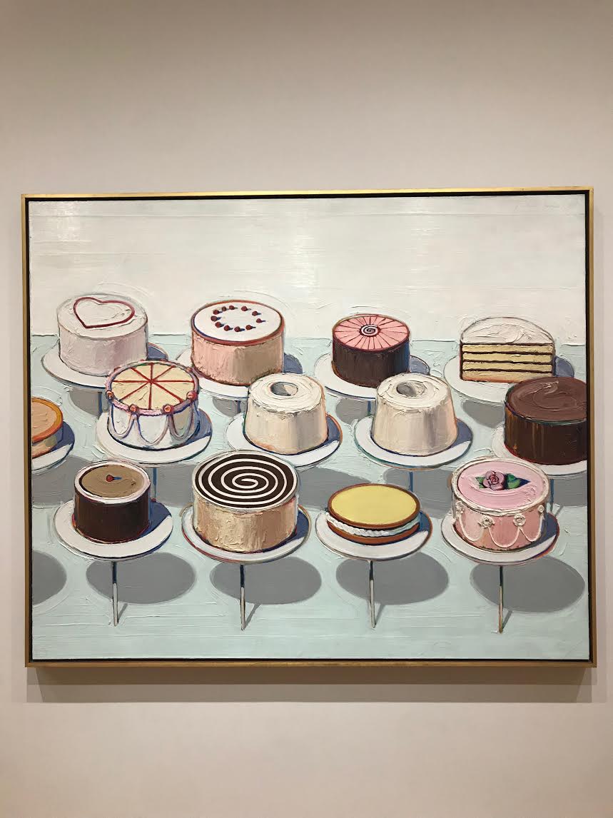
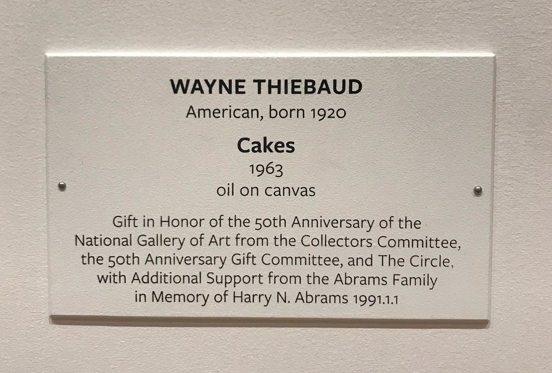
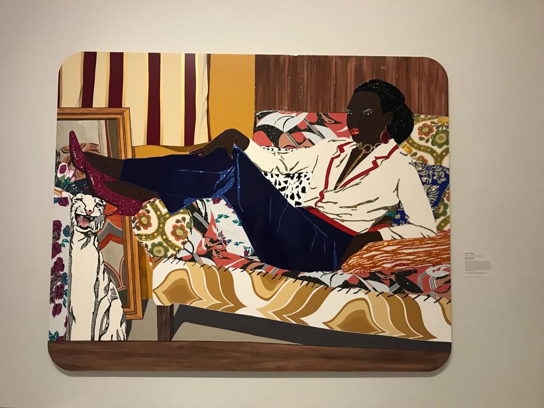
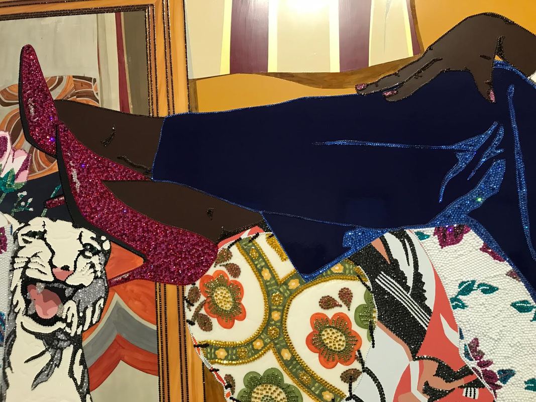
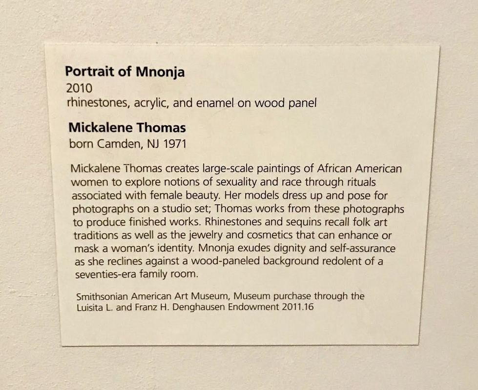
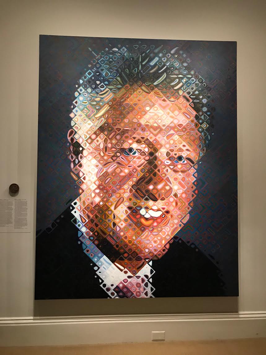
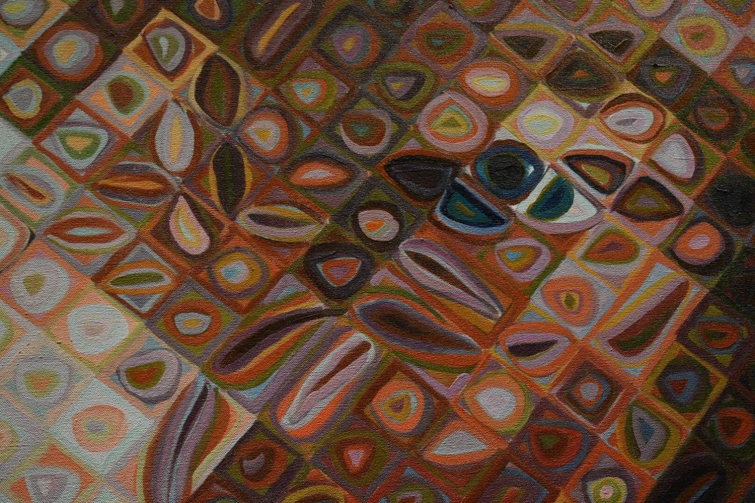
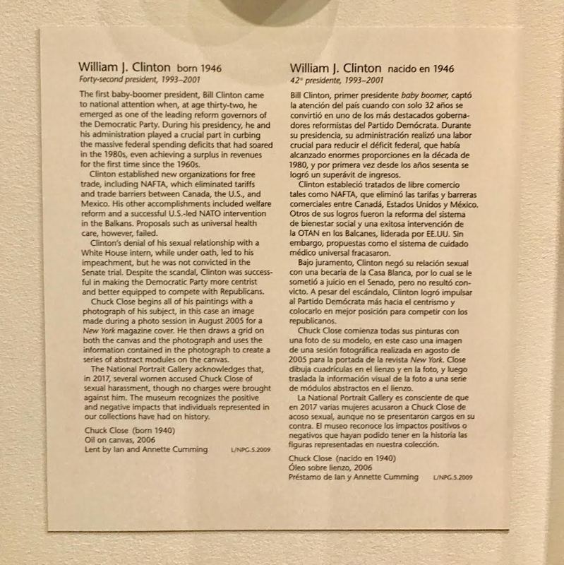
Last Friday, our art class went to DC to explore the national art galleries. Specifically, we looked for pieces that we could build off of or that related to our past works. For me, I looked for figures. Ultimately, we did not see many figure-related exhibits, however, we went to the National Portrait Gallery, and found some amazing pieces. Additionally we looked at Abstract Expressionist paintings in light of our upcoming Abstract Expressionist Project. Abstract Expressionist Pieces:1.2.3. The first piece almost reminds me of the side of a riverbank, where different colors emerge due to the range of different plants, animals, and often runoff that mixes in with a stream. I really love the title and how it really challenges the viewer to really feel the almost chemical sentiment of this piece. I think here for the most part, the artist utilized large, gestural brushstrokes, using several different layers, tones, and colors to add depth. This piece largely reflects the large, compositional, tonal abstract expressionist style - much like Rothko’s characteristic style. For me, personally, I find Rothko’s paintings largely uninteresting, however, this piece makes a statement. Rather than making the piece fully one tone, the artist utilizes the right side, adding stripes of color, as well as borders small pieces of the edge, giving a largely different feeling than Rothko’s pieces. The second piece is captivating in its depth. From afar, there is little to be seen, however, as the viewer approaches the piece, they can take note of the slightly different hues, and the different thicknesses and textures of the paint. The application and layering of different colored and textures paints a really captivating dynamic between the two elements in that, while the color change is very subtle, there is dramatic effect and statement in the differing texture. The third piece is my absolute favorite. I really enjoy the idea of painting “big”. There is an interplay between the canvases, however, they do not exactly match up. Here the artist seemingly used a large brush and made shorter strokes. There is a sense of spontaneity and looseness in the application of the strokes, however, that remains enjoyable, and gives a sense of energy to the piece. Each of these pieces, compositionally and stylistically differ; in color palettes, and expressions. The first and second are largely more meditative and contemplative, while the third is quite joyful. I was largely surprised by the different applications of paint and the general use of texture as an element in these pieces. I think from my studies and seeing of abstract expressionist pieces online it is especially hard to see differing texture in a piece, however, I really enjoyed looking at the different layers up close. I think in general, for my future Abstract Expressionist painting, I want to do many different colors and experiment with dynamic application and a more colorful color palette. I am curious, however, as to whether or not there is a restriction to how one can apply paint in Abstract Expressionist art; can an artist only use a paintbrush? Play Pages:1. I really enjoy the frugality and frivolity of this piece. Its static in its composition, however, its subject, and artistic rendering make it a truly fun piece. I mean, who doesn’t love cake? I think ultimately pastel-like color palette as well as the paint medium ties into the almost indulgent content of the work. At times there is just so much that one cannot consume all. The intangibility of the 2D work plays with the viewer. After seeing a sweet, often people really want one. The irony behind the work plays off of want and not having. I think that my play pages are very fru-fru and I really like the idea of adding more to them. Compositionally, I want my figures to be doing more than just standing, and I really like the idea of adding more “indulgent” elements to my overall work. 2. I absolutely ADORE this piece. I have really enjoyed playing with the female figure, and the use of glitter and gems. Of course, the immense size of this piece screams authority, however, the use of gems draws in the viewer from across the room. Ultimately, Thomas makes a statement on the beauty and power that an African-American woman wields. There is a stark dynamic between sparkle and matte which I think adds an effective contrast between what is “important” and “unimportant.” The woman’s clothing, jewelry, and shoes are bathed in gems, serving to highlight the figure and bring her to the forefront of the work. The frontal composition, additionally highlights the figure and establishes her as the focal point of the piece. In the past I have played with sparkles on my figures’ clothing, however, I also really like the idea of playing with them in the background. I think after this trip as a whole, I really would like to playing with more dynamic, and interesting backgrounds to my pieces. 3. This piece, aside from it being a portrait, really has nothing to do with any of my past play pages, however, I just admire the true ingenuity of Chuck Close. From afar, the figure looks almost realistic, however, upon closer inspection, the figure consists of almost incomprehensible blobs. Close’s use of color really highlight the figure’s features and bring to light the dynamic nature of a face in three dimensions. The static, closed composition, establishes and highlight Bill Clinton as the subject. The technique is truly truly MIND BOGGLING. I really cannot understand how he does it. I don’t think I would ever be able to replicate this in future art works, however, I really would like to push the abstraction in my rendering of figures using similar color theory ideas.
1 Comment
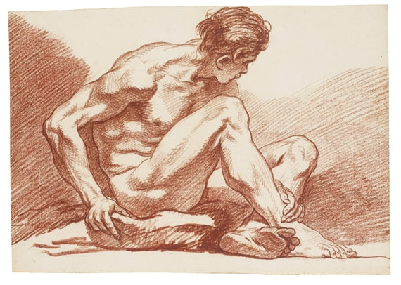
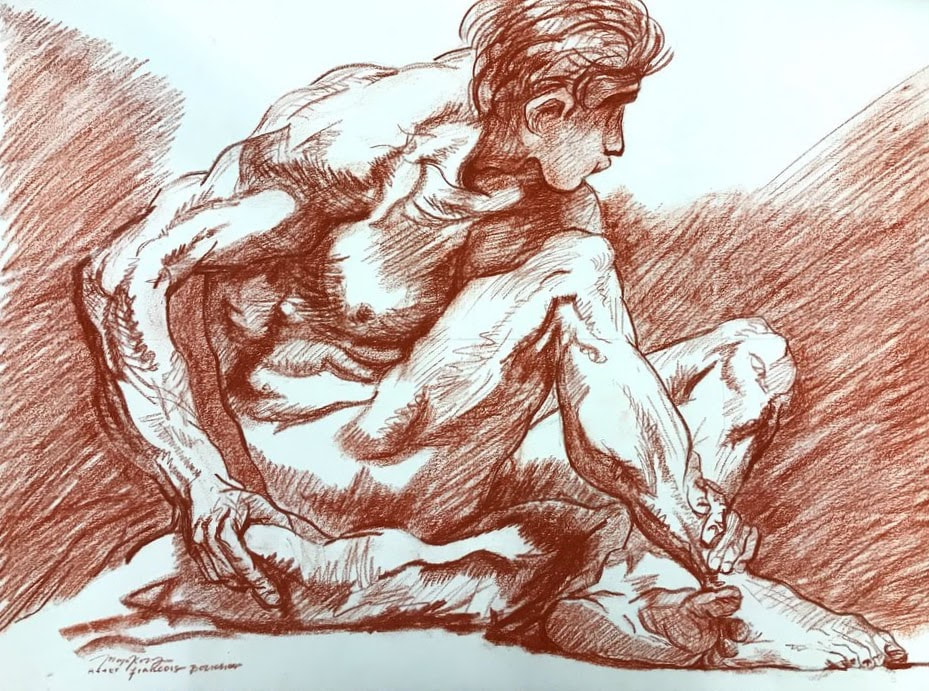
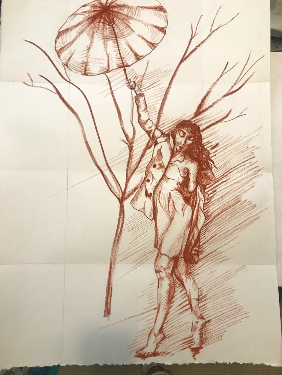
Done! If I wasn't trying to go for a self-portrait, I think the drawing would be okay, but overall, the drawing doesn't look much like me, which is kinda a bummer. Besides the face (which I am at a loss for), I really struggled to draw the legs. In the original piece, the figure was extremely muscular. Ultimately I am not, so I struggled to get the defined legs from my picture, but not make them super boxy. I think I could've better achieved this if I had made lighter marks. I do think that I utilized my old master's mark rather okay. I tried to be more mindful of my use of line quality and deep shadows. I made sure to take more time in my hatching lines as well as keeping my values relative to each other. I couldn't bear to take a picture of just my preliminary sketch. So here is just a series of today's work. I ultimately don't think that the face looks very much like me but we'll see! |
What's Up WorldUpdating you. Archives
February 2020
Categories |

 RSS Feed
